1. Introduction
Seventies and Eighties jewellery, dated 1970 to 1989, can be read as a bridge between postwar modernism and the luxury language that takes shape after 1990. In Western Europe and North America, many jewels favour bolder scale, clearer silhouettes, and a more public language of fashion and status. Yellow gold becomes prominent again, and diamonds and coloured stones are often used for visual effect.
These decades also mark a change in how jewellery is positioned and consumed. Fine jewellery becomes more closely linked to seasonal fashion, designer identities, and more visible luxury branding. At one end, major houses and workshops push sculptural goldwork and bold stone settings into modern glamour. At the other, more accessible gold and diamond jewellery mirrors the same appetite for volume and shine.
As a style category, Seventies and Eighties jewellery is not one uniform look. In practice, many jewels from these decades are easier to recognise by scale, surface, and construction than by one neatly defined style form. Certain tendencies recur across markets: chunky chain links and bold earrings, smooth sculptural gold forms, pavé and channel set surfaces, and cocktail rings designed to be noticed. The aim of this page is to give you a practical recognition lens, and to show how these decades connect the visual world of the sixties to the post 1990 vocabulary of high jewellery.
2. Historical Framework
The early seventies continue the late sixties appetite for experimentation, but the tone becomes more pragmatic. High inflation and volatile gold prices helped reinforce gold as something to be seen, worn as a visible store of value as well as adornment. In many markets, the eighties brought a more overt display of luxury, and jewellery more often functioned as a public signal rather than a private accent.
Design influences are widely mixed in these decades. Late modernist restraint continues, but it sits alongside bold fashion statements, historic references reworked for modern wear, and an appetite for pieces with immediate visual impact. Production also becomes more international. Alongside expanded manufacturing in parts of Asia, Turkey’s modern jewellery sector accelerated after the gold trade was liberalised in the 1980s, with import and export restrictions gradually lifted, helping an export oriented manufacturing cluster develop around Istanbul.
Alongside fashion, the wider design culture of the period, from interiors to industrial design and commercial display, favours bold scale, clean volumes, and surfaces that perform under bright light. Jewellery translates this into forms that read clearly at a glance, and into construction choices that privilege presence: domed gold, broad textured planes, modular chains, and settings that turn many small stones into one continuous surface of brilliance.
In jewellery terms, the main tendency is the move from discreet refinement to deliberate presence. Jewellery is often worn as part of a coordinated look, working with clothing to build a recognisable silhouette. This is not unique to the period, but in the 1980s it aligns with power dressing and other mainstream fashion cues that favoured strong, legible silhouettes. A frequently described look is to wear several bracelets at once, often mixing bangles with link bracelets, including patterned curb link types such as the figaro pattern. This does not mean subtle jewellery disappears, but it becomes less defining for the mainstream image of the period than bold gold, assertive scale, and confident sparkle.
3. Design Language and Aesthetics
Seventies and Eighties jewellery often prioritises silhouette and mass. Smooth, sculptural forms create volume through domed profiles, thickened edges, and broad surfaces that catch light even without gemstones. Gold is often the dominant visual metal, with coloured gold alloys, including two tone and tri colour combinations, used for richness and contrast. Ribbing, engraving, hammering, and satin finishes are used so the metal reads as design in its own right.
In effect, the jewellery borrows an object design logic familiar from contemporary interiors and product design, with strong volumes, tactile surfaces, and modular components intended to read under bright artificial light and at social distance.
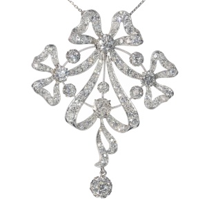
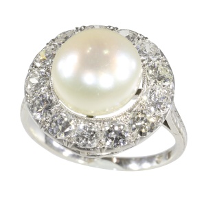
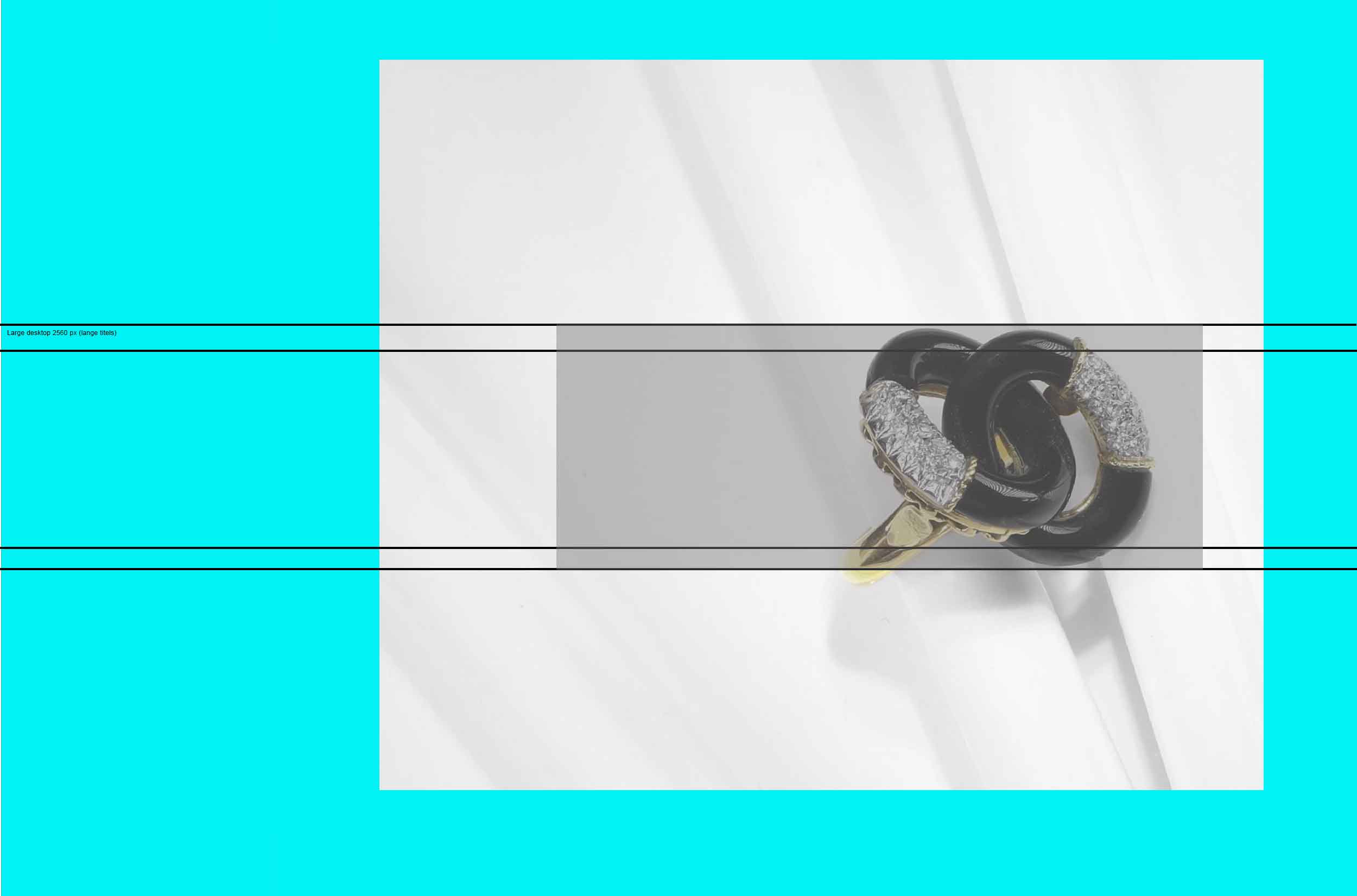
When gemstones are central, they are often arranged for graphic impact. In the 1980s, pavé and channel settings made small diamonds (melee) central, building near continuous surfaces of sparkle. Coloured stones are used in strong blocks, frequently as cabochons or generously sized cuts, with emphasis on strong colour and legibility. Earrings in particular grow larger and more elaborate, including hoops, clips, and long dangling forms, sometimes worn alongside studs as multiple piercings become more common.
There is also a clear taste for repetition and modularity. Chains can become statement elements, and suites of related pieces are common. Motifs are often reduced to clear, legible forms rather than intricate narrative detail. The visual grammar is direct, often designed to be immediately readable rather than slowly discovered.
4. Materials and Techniques
Seventies and Eighties jewellery is strongly material led, with gold, often in two tone or tri colour combinations, treated as both status and design language. The decade favoured a massive look even as gold prices fluctuated, and hollow chains and electroforming helped create volume without excessive weight. Diamonds remain central, but they are often deployed as small stones (melee) in pavé and channel settings, that read as continuous brilliance rather than as isolated stones.
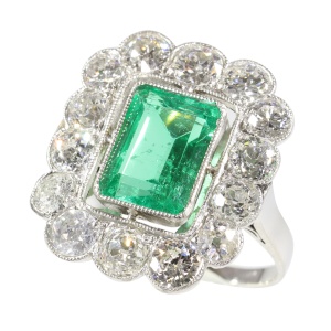
Coloured gemstones are often chosen for saturation and presence. Cabochons, sizeable faceted stones, and strong colour pairings are common, and opaque materials and enamel can return to the palette where a bold graphic effect is desired. Large fields of enamel, whether fired enamel or resin, can amplify that block colour effect. Platinum and white gold remain present, particularly in diamond heavy pieces, but gold remains visually central, often expressed through two tone and tri colour combinations as well as plain yellow or white gold.
Setting styles in these decades often emphasise continuity and surface. Pavé and channel settings, and tight clusters produce near uninterrupted brilliance, while sculptural goldwork can be paired with crisp, bezels for coloured stones. Textured finishes, from ribbing to engraved patterning, help large surfaces avoid flatness, and suites of related pieces reinforce the period’s taste for coordinated visual impact.
5. Function and Meaning
In the seventies and eighties, jewellery is often worn as a visible part of dress and fashion. It signals prosperity, confidence, and professional presence, as well as taste. In many settings, especially urban and commercial ones, jewellery can function as an immediately readable signal rather than a private symbol.
Brand identity can be more visible, not only through explicit logos but through recognisable house signatures in chain design, stone setting, and recurring forms. Jewellery can act as a portable form of affiliation, signalling a relationship to a certain world of taste and consumption. At the same time it is important to remember that perhaps most seventies and eighties jewels were created and worn simply because their materials, colours or forms appealed, without any further intention than beauty and attraction.
There is also a shift in gifting and self purchase patterns. Jewellery is still used for milestones, but it is also bought as a personal reward, a sign of independence, or a deliberate addition to a working wardrobe. In the 1980s, as more women pursued careers and high profile positions, women buying their own jewellery became an important market. Jewellery can be both sentimental and strategic, combining personal meaning with an awareness of material value.
6. Notable Creators and Exemplary Pieces
In this period, the seventies and eighties often offer identifiable makers, yet the style is frequently better recognised through house signatures and market categories than through individual authorship. Certain brands and design studios develop recognisable vocabularies in chain construction, gold surface treatment, and diamond setting, and these signatures can be echoed through the wider market. As a result, exemplary pieces are those that show the decade’s visual priorities with clarity, even when the maker is not rare or collectible in a narrow sense.
Exemplary pieces from the seventies and eighties often fall into a few recognisable families: sculptural gold, often in two tone or tri colour combinations, necklaces and bracelets built as bold volumes, diamond set surfaces designed as continuous fields, and large earrings and cocktail rings that prioritise silhouette. Some houses and designers develop recognisable signatures in chain construction, surface treatment, and diamond setting, and these cues are echoed widely across the market. For this page, the point is not a definitive list of makers, but a set of examples that train recognition: how mass, surface, and coordinated impact define the period’s mainstream look.
If you want to use this page as a recognition guide, focus on pieces where the decade’s priorities are unambiguous: a chain that is deliberately oversized, a surface that becomes a diamond texture rather than a single stone statement, or a sculptural gold form that reads as design even without gems. As a rule of thumb, these cues are often easier to place in time, because they are faithful to the period’s visual logic rather than to a single short lived fashion detail.
7. Recognition and Practical Checks
Recognition often starts with scale and silhouette. Look for jewellery that is intentionally visible: thick chains, domed gold forms, bold earclips or hoops, and rings that dominate the hand. The surfaces are often confident and continuous, either as broad metal planes with texture, or as near continuous fields of stones. Many pieces are designed to read at a glance.
Stone setting can be particularly revealing. Channel set rows, pavé textures, and tight clusters that behave like a single surface are common, especially in pieces that aim for glamour. Coloured stones are often used for strong blocks rather than for subtle graduations, and cabochons are frequently chosen for a smooth, confident look. When you see a piece that combines saturated colour, heavy gold presence, including two tone or tri colour gold, and a design built around volume, the decades from 1970 to 1989 are often a strong candidate.
Construction and wear patterns help refine the call. Electroformed pieces can look substantial while remaining relatively light, and their seams and wall thickness can differ from solid work. Clasps and hinges often reflect modern manufacturing, and maker’s marks, serial numbers, and brand signatures become more common and can support dating. As always, remember overlap: some late sixties pieces anticipate the seventies, and many late eighties designs feed directly into the post 1990 high jewellery vocabulary.
The wider market also produced replicas and close imitations of earlier styles, including Art Deco inspired pieces. In the 1980s, renewed interest in invisibly set stones led to widespread imitation, so you may encounter commercial jewels with calibrated ruby or sapphire surfaces set with no visible metal between the stones. In rings, you may also see raised diamond cluster heads built as a basket setting, and alliance rings where wire built construction is part of the look. When a jewel looks older but contains many small brilliants, the melee can offer a practical clue: older small brilliants more often show a culet facet and greater variation from stone to stone, while later mass cut melee tends to look more uniform, with very small culets or none. This remains a clue rather than a proof, because stones can be recut or replaced.
8. Related Styles and Legacy
This page sits close to Sixties jewellery, Modernism, and Brutalist jewellery, but it also moves away from them. Where sixties design often values experimentation and formal innovation, the seventies and eighties more often lean towards glamour, legibility, and confident scale. It also forms a bridge towards post 1990 luxury jewellery, because many of the period’s habits, bold gold presence, pavé surfaces, and coordinated impact, remain active in later luxury jewellery.
Beyond the modernist lineage, these decades also sit close to the growth of luxury branding and to a clearer split between high jewellery and commercially produced gold and diamond jewellery. The same visual priorities, volume, shine, and immediate readability, can appear at very different price points, which is one reason the period is useful for recognition. It also helps explain why later highly diamond set looks, built as near continuous surfaces of small stones, can feel like an intensification rather than a complete break, the appetite for conspicuous surface has roots in these decades.
For collectors, this period is also a practical hinge in dating. Pieces that feel too bold to sit comfortably in postwar modernism, yet not quite aligned with the post 1990 high jewellery emphasis on refinement and brand driven signatures, may fit the seventies or eighties. Seen in that light, the period is not only a taste category but a useful organising tool in the jewellery market, helping to separate late modernist objects, fashion led gold jewellery, and later contemporary luxury into clearer groups.
9. Purpose of This Page
This page provides an overview of the seventies and eighties jewellery within the context of jewellery history and design. It focuses on what is most relevant from a jewellery perspective and does not aim to be a full encyclopaedia of the seventies and eighties. Instead, it offers a concise and structured introduction that highlights key interpretive angles and points towards deeper study.
This page is part of the Adin Jewellery Glossary and is also included in the Adin Styles Overview, where each style is presented with curated reference fields for browsing and comparison. Use and sharing for educational purposes are welcomed. If you reference or quote this page, please mention Adin as your source.
10. Accuracy Note
Every effort has been made to present this information accurately and in line with current historical understanding. Interpretations may evolve as new research becomes available, and readers who notice points for refinement are welcome to share their insights.
11. Author Attribution
Elkan Wijnberg, Jewellery Historian and Antique Jewellery Specialist – Adin – www.antiquejewel.com